Rollover a bar to see the book’s details.
tides

Drawing derived from forecast tides for 379 days. High and low tides are utilized as well as phases of the moon, equinoxes, and solstices.
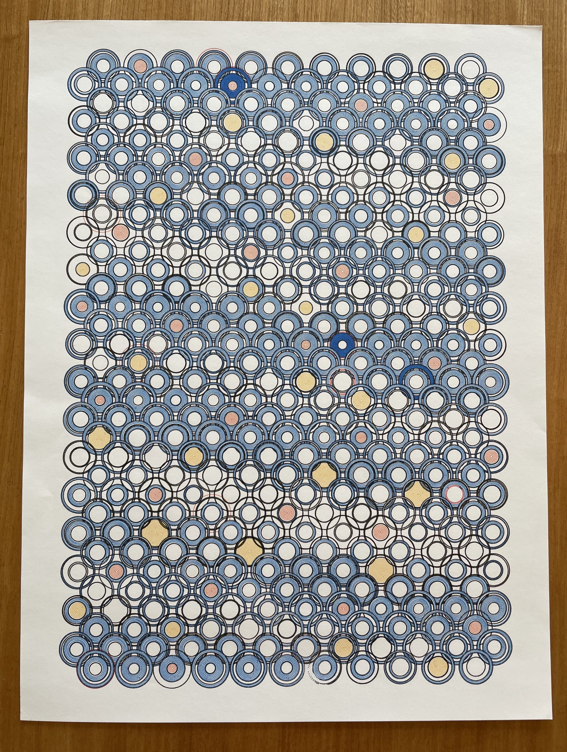
seismic flowers

This drawing is made using data from the largest earthquake every day for 379 days. The magnitude, depth, and continent that it occurred on are utilized. The intent is not to visualize the data for evaluation, but use it as a composition element.
The flowers are inspired by a traditional Japanese textile pattern.

Seismic
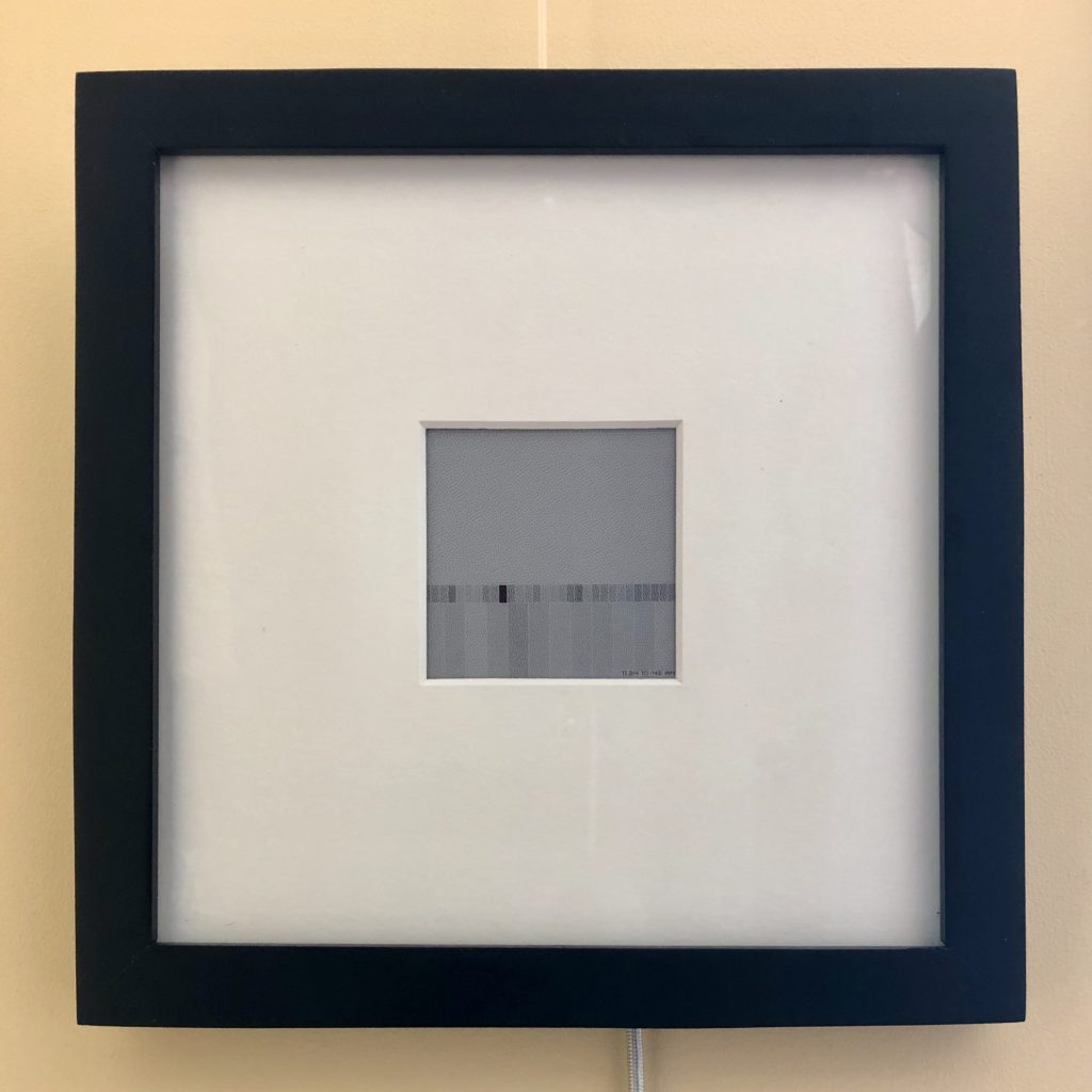
Visualization of earthquakes in the San Francisco Bay Area. Grey value indicates the magnitude of the most recent quake (top), all quakes in the past 24 hrs (bottom), and max quake each day for the past 30 days (middle).
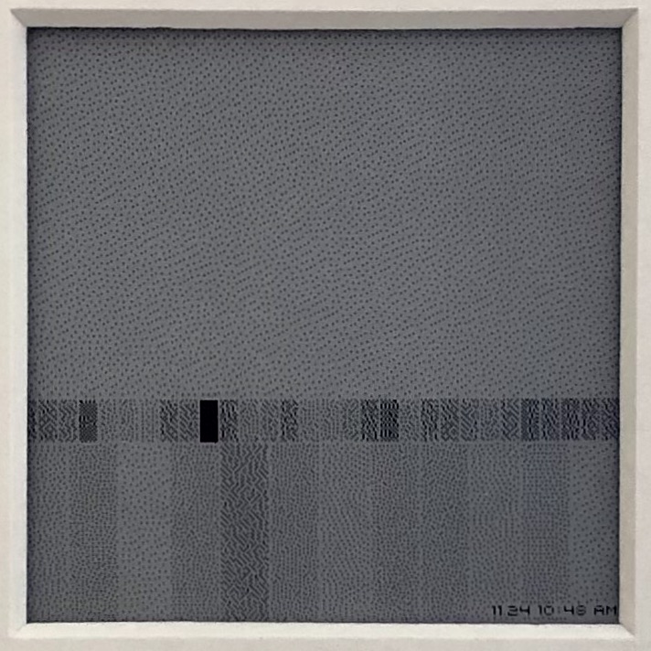
Made using a Raspberry Pi Zero W and a Pimoroni Inky wHAT, mounted in an 8 inch square frame.
Arc Diagram of Mentions in @Odopod Tweets
Lately I’ve been collecting and analysing Twitter data. I’ve been looking at networks formed by friends and followers of a set of people, tracking the path of tweets and generally building on my python skills.
I’m working toward a pretty ambitious goal but, inspired by the arc diagrams in the NYTWrites project, I decided to take a short break and render out one of my own.

Interactive Arc Diagram
The diagram shows all twitter users mentioned in tweets by @Odopod, sorted by the number of times they have been mentioned. The arcs link nodes that were mentioned in a tweet with other users and the width of the arc indicates the number of links. The size of the nodes represent the number of links a node has associated to it.